
In the constantly evolving world of trading, the Moving Average Convergence Divergence (MACD) indicator has become a trusted tool for technical analysis. Developed by Gerald Appel in the late 1970s, the MACD helps traders identify changes in momentum and potential trend reversals. By analyzing the interaction between two moving averages of a security’s price, it offers meaningful insights into a trend’s strength, direction, and duration.
Understanding the MACD Indicator
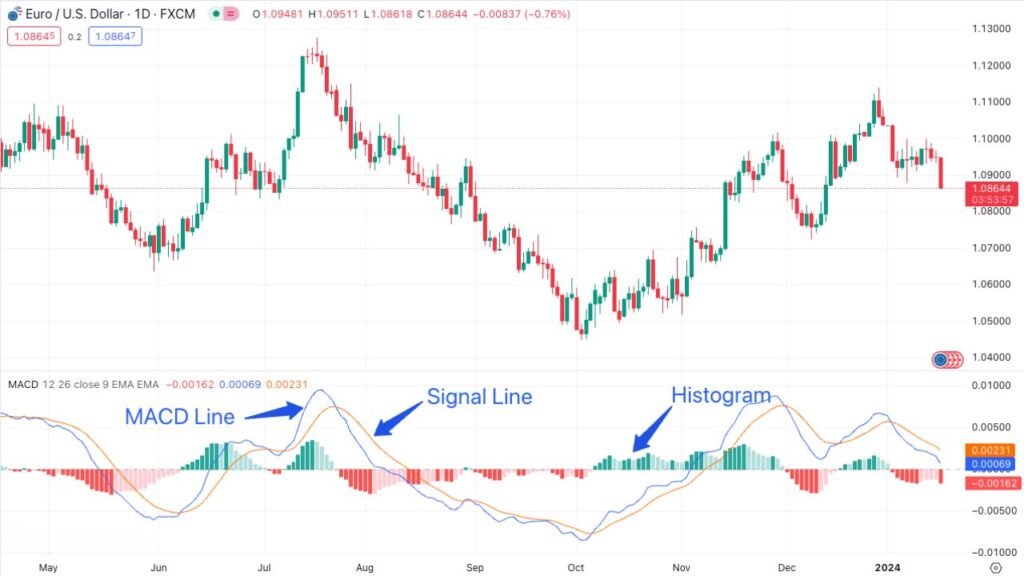
The Moving Average Convergence Divergence (MACD) indicator is a powerful yet straightforward tool used in the financial markets to measure momentum and identify potential trend shifts. To truly understand how the MACD works, it’s important to break down its three key components: the MACD line, the signal line, and the histogram. Each plays a distinct role in helping traders interpret market behavior and make more informed decisions.
The MACD Line: Trend Direction and Momentum
The MACD Line is the core of the indicator. It’s calculated by taking the difference between two key Exponential Moving Averages (EMAs) of a security’s price: the 12-day and the 26-day EMAs. The formula is straightforward:
MACD Line = 12-day EMA – 26-day EMA
This calculation results in a line that moves around a zero point, providing traders with a dynamic view of the market’s momentum. When the MACD Line is above zero, it means that the short-term average is higher than the long-term average, suggesting upward momentum and a potential bullish trend. Conversely, when the MACD Line is below zero, it signals that the short-term average is lower than the long-term average, implying downward momentum and a potential bearish trend. The MACD Line’s slope also provides insights: a steeper slope indicates stronger momentum, while a flatter slope suggests weakening momentum.
The Signal Line: Identifying Potential Trading Signals
The Signal Line is essentially a smoother version of the MACD Line, calculated as the 9-day EMA of the MACD Line. Its formula is:
Signal Line = 9-day EMA of MACD Line
The Signal Line acts as a reference point for spotting potential trading signals. When the MACD line crosses above it, traders often see this as a bullish sign; a possible cue to buy. On the other hand, a cross below the Signal Line is typically seen as bearish, hinting at a potential selling opportunity. These crossovers are closely watched, as they can signal important shifts in momentum and changes in trend direction..
The Histogram: A Visual Representation of Momentum Changes
The Histogram is a graphical representation that illustrates the difference between the MACD Line and the Signal Line. It is calculated as:
Histogram = MACD Line – Signal Line
The Histogram appears as bars on a chart, fluctuating above and below a zero line. When the Histogram is positive (above zero), it indicates that the MACD Line is above the Signal Line, which can be a sign of bullish momentum. When the Histogram is negative (below zero), it suggests that the MACD Line is below the Signal Line, potentially indicating bearish momentum. The height of the bars is also significant: taller bars represent greater momentum, while shorter bars suggest weaker momentum. Rapid changes in the Histogram can be a sign of a strong shifts in momentum, providing traders with early warnings of potential trend reversals.

In summary, the three components of the MACD indicator work together to give traders a well rounded view of market momentum and trend direction. By understanding how the MACD line, Signal line, and Histogram interact, traders can make more informed decisions about when to enter or exit a position. The MACD line highlights the strength and direction of the trend, while the Signal line helps pinpoint potential trade signals, especially during crossovers..
Finally, the Histogram provides a visual snapshot of momentum shifts and trend strength, making it easier to quickly identify changes in market behavior.
Traders often watch for specific patterns and movements within these components to help guide their decisions. For instance, a rising MACD line along with a growing positive histogram typically signals strong bullish momentum. On the flip side, a declining MACD line paired with an increasingly negative histogram can point to a strengthening bearish trend.
It’s important to note that while the MACD is a powerful tool, it’s most effective when combined with other technical analysis techniques. Using it alongside additional methods helps confirm signals and reduces the chances of being misled by false positives. Just as important is understanding the broader market context and the specific asset you’re analyzing, both are key to interpreting the MACD accurately.
By mastering the nuances of the MACD Line, Signal Line, and Histogram, traders can enhance their ability to identify potential trading opportunities and make well-informed decisions in the financial markets. The MACD Indicator’s versatility makes it suitable for a variety of trading styles and markets, reinforcing its status as a fundamental tool in technical analysis.
How to Use the MACD Indicator
One of the MACD indicator’s greatest strengths is its versatility, allowing traders to apply it in multiple ways to enhance their analysis and refine their trading strategies. Let’s take a closer look at the key ways the MACD can be used in practice:
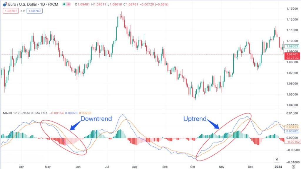
Identifying Trend Direction
The movement of the MACD line plays a crucial role in signaling the direction of a market trend. When the MACD line rises, it usually means the shorter-term moving average is pulling away from the longer-term one; a sign of a potential uptrend. This upward movement often points to growing bullish momentum, which may prompt traders to consider entering long positions.
On the other hand, when the MACD line trends downward, it suggests a potential downtrend, as the shorter-term moving average falls below the longer-term one. This typically signals growing bearish momentum, leading traders to consider short positions or to exit existing long trades. The MACD line’s position relative to the zero line also adds important context. Readings above zero generally point to a bullish trend, while values below zero indicate a bearish outlook.
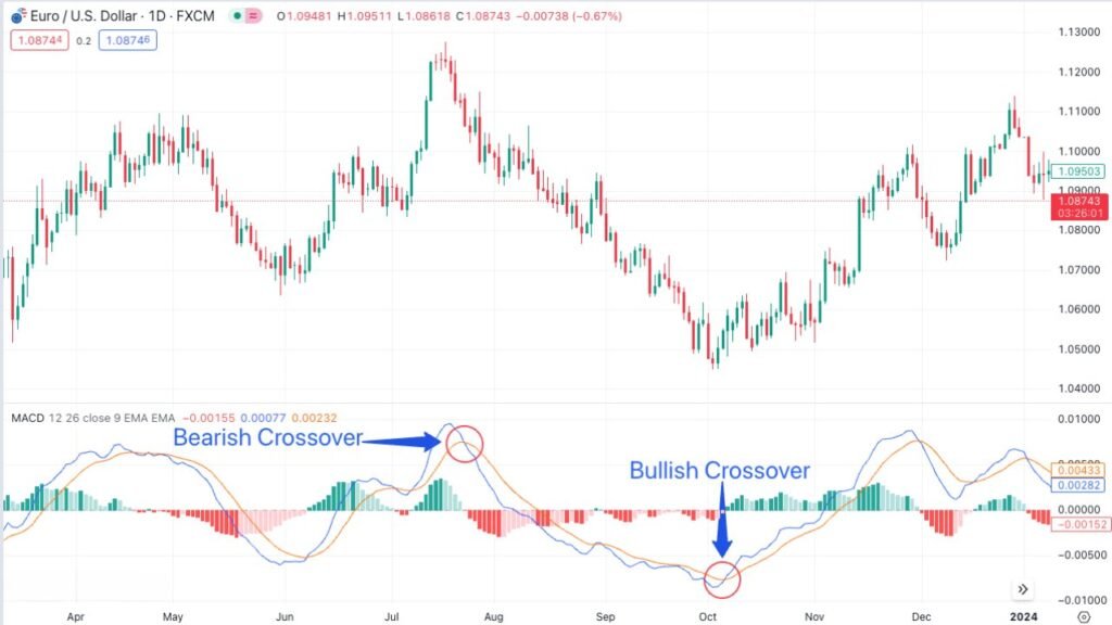
Crossovers
Crossovers are among the most significant signals generated by the MACD Indicator. A bullish crossover occurs when the MACD line crosses above the signal line. This event is seen as a potential buy signal, as it suggests that bullish momentum is increasing and that the trend might continue upward. Traders often use bullish crossovers as an entry point for long positions.
On the other side, a bearish crossover happens when the MACD line crosses below the signal line. This is typically interpreted as a sell signal or a warning to avoid entering new long positions, as it indicates increasing bearish momentum and the possibility of a continuing downward trend. Bearish crossovers are often used as a signal to exit long positions or to initiate short positions.
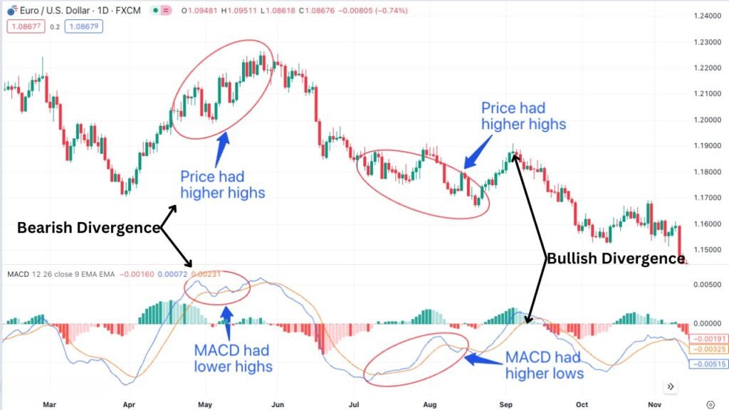
Divergences
Divergences between the MACD and price action are critical indicators of potential trend reversals. A bullish divergence happens when the price records lower lows, but the MACD forms higher lows. This situation suggests a decrease in downward momentum and a possible upward reversal. Traders often view bullish divergences as a signal to consider long positions or to exit short positions.
Conversely, a bearish divergence happens when the price makes higher highs while the MACD makes lower highs. This indicates that upward momentum is weakening, and a downward trend reversal may be imminent. Bearish divergences are seen as a signal to consider short positions or to exit long positions.
The Histogram
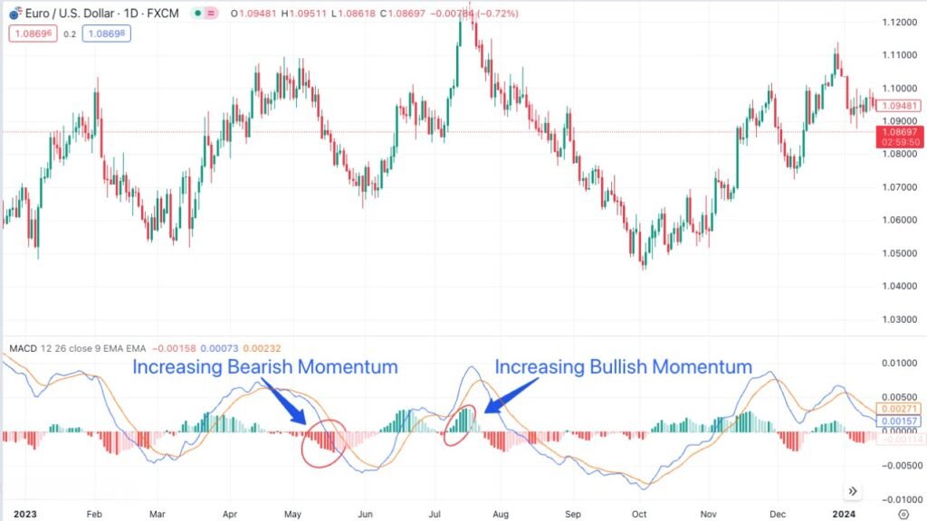
The Histogram, which reflects the difference between the MACD line and the signal line, is a helpful tool for spotting quick shifts in momentum. When the Histogram expands ; growing taller in either the positive or negative direction, it signals that momentum is building in the current trend. A rising positive Histogram suggests increasing bullish strength, while a deepening negative Histogram indicates growing bearish pressure.
Conversely, a shrinking Histogram (bars getting shorter) suggests weakening momentum. This can be an early sign of a potential trend reversal. For instance, if the Histogram is positive but begins to shrink, it may indicate that bullish momentum is fading and a bearish reversal could be on the horizon.
By learning to interpret the different elements of the MACD indicator, traders can develop a more nuanced understanding of market trends and momentum, helping them make smarter trading decisions. That said, no indicator is foolproof. For the best results, the MACD should be used alongside other technical tools and supported by a solid understanding of fundamental factors to create a well-rounded trading strategy.
Limitations and Best Practices of the MACD Indicator
The MACD Indicator, despite its widespread popularity and utility in technical analysis, has certain limitations that traders must be aware of to use it effectively. Understanding these limitations and implementing best practices can greatly enhance the effectiveness of the MACD in a trading strategy.
Limitations of the MACD
- Lagging Nature: One of the primary limitations of the MACD is its lagging nature. As the MACD is derived from moving averages, which are based on past price data, it inherently reacts to price movements with a delay. This means that signals generated by the MACD, whether for trend reversals or momentum changes, may occur after the price movement has already begun. As a result, traders might miss out on the initial phase of a new trend.
- False Signals: In markets experiencing high volatility or choppy trading conditions, the MACD can generate false signals. For instance, during sideways market movements, the MACD might indicate bullish or bearish crossovers that do not result in a sustained trend, leading to misleading signals and potential trading losses.
Overreliance on Historical Data: The MACD’s reliance on historical price data means that it cannot predict future market movements or sudden changes in market sentiment. Traders must be cautious not to overly rely on the MACD for predictions but rather use it as one of several tools for understanding market trends.
Best Practices for Using the MACD
To address these limitations and make the most of the MACD Indicator, traders can adopt the following best practices:
- Combining with Other Indicators: One effective way to mitigate the limitations of the MACD is to use it in conjunction with other technical indicators. For example, combining the MACD with indicators like the “Relative Strength Index (RSI), Bollinger Bands, or Stochastic Oscillator” they can provide a more comprehensive view of the market and help validate the signals generated by the MACD.
- Incorporating Price Action and Chart Patterns: Alongside technical indicators, traders should consider price action and chart patterns. Analyzing support and resistance levels, trend lines, and candlestick patterns together with the MACD can provide additional context and help confirm or refute the signals it generates.
- Understanding Market Context: It’s crucial for traders to understand the broader market context and fundamental factors that might influence price movements. The MACD should be used as part of a broader analytical framework that considers economic indicators, market news, and other relevant information.
- Risk Management: To guard against false signals and the inherent risks of trading, implementing sound risk management strategies is essential. This includes setting stop-loss orders, managing position sizes, and having a clear entry and exit strategy.
- Continuous Learning and Adaptation: The financial markets are dynamic, and what works in one market condition might not work in another. Traders should continuously educate themselves, stay updated with market trends, and be willing to adapt their strategies as necessary.
By understanding the limitations of the MACD indicator and applying best practices, traders can make better use of this tool to strengthen their analysis and improve trading outcomes. The key is to incorporate the MACD into a broader strategy that takes multiple factors and indicators into account.
Conclusion
The MACD indicator is a powerful tool that helps traders better understand market trends and momentum.
Its balance of simplicity and reliability makes it a favorite among both beginners and seasoned professionals. When used correctly, the MACD can significantly enhance a trader’s analysis and support more confident decision-making.
FAQ
The Moving Average Convergence Divergence (MACD) indicator is a trend-following momentum tool widely used in technical analysis. It helps traders spot shifts in momentum, determine trend direction, and anticipate potential reversals by analyzing the relationship between two moving averages of a security’s price.
The MACD Line is calculated by subtracting the 26-day Exponential Moving Average (EMA) from the 12-day EMA. This calculation provides a dynamic view of the market’s momentum and trend direction.
The Signal Line in the MACD Indicator is a 9-day EMA of the MACD Line. It acts as a trigger for buy and sell signals and is crucial for identifying crossovers between the MACD Line and itself.
The MACD Histogram represents the difference between the MACD Line and the Signal Line. It is a visual tool that helps traders spot changes in trend momentum. Rapid changes in the histogram, such as increasing or decreasing bar heights, can signal strong shifts in momentum and potential trend reversals.
A bullish crossover occurs when the MACD Line crosses above the Signal Line, suggesting a potential buy opportunity due to increasing bullish momentum. A bearish crossover happens when the MACD Line crosses below the Signal Line, indicating a potential sell opportunity and increasing bearish momentum.
A divergence in the MACD indicator happens when its movement doesn’t align with the price action of the security. A bullish divergence, where the price makes lower lows while the MACD forms higher lows, can signal a potential upward reversal. Conversely, a bearish divergence, when the price reaches higher highs but the MACD posts lower highs, may point to a possible downward trend reversal.
Like any technical tool, the MACD indicator has its limitations. Because it’s based on moving averages, it tends to lag behind price action, which can lead to delayed signals. It’s also susceptible to false signals, particularly in volatile or sideways markets. That’s why it’s best to use the MACD alongside other technical indicators and analysis techniques to confirm signals and improve reliability.
Traders can offset the MACD’s limitations by pairing it with other technical indicators, studying price action and chart patterns, and keeping the broader market context in mind. Effective risk management and the ability to adapt to changing market conditions are also essential. When used as part of a well-rounded trading strategy, the MACD becomes a much more powerful and reliable tool.